
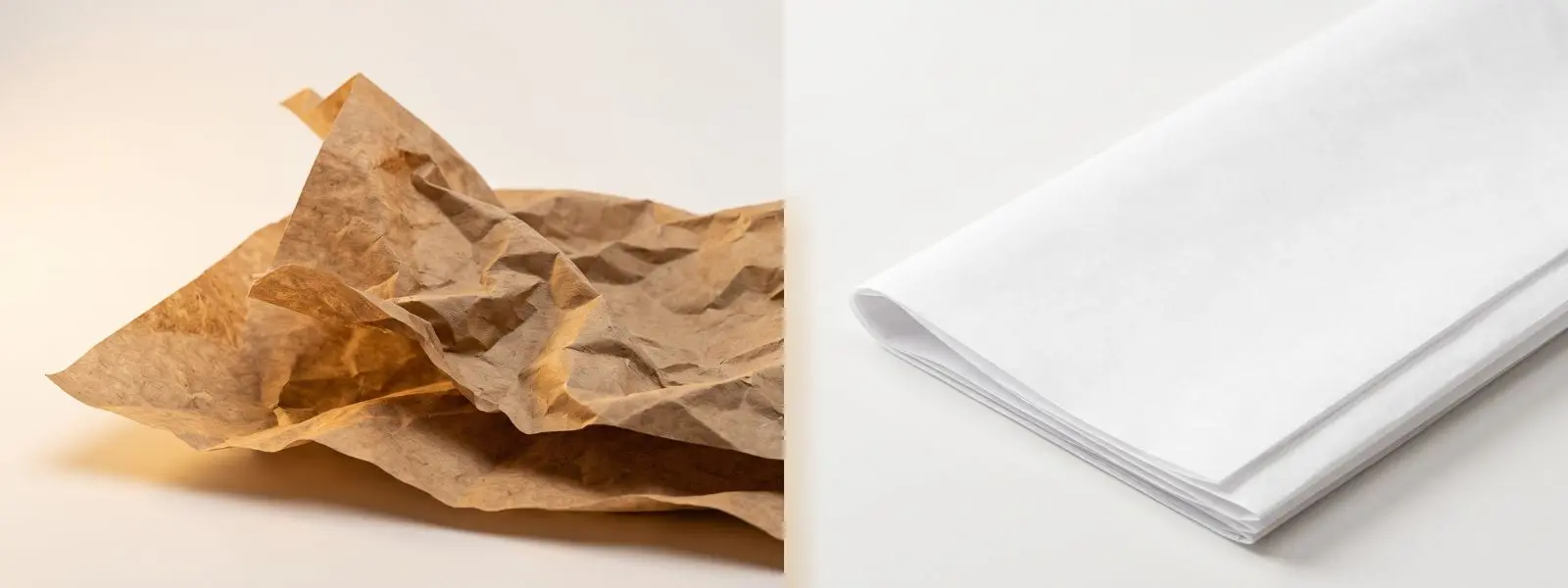
Kraft or white is the first decision most brands make when ordering custom tissue paper, and it shapes far more than colour. The base colour of the sheet changes how your logo prints, what your brand signals to the customer, and even what the run costs. Choosing on gut feel alone often leads to a design that looks muddy on the tissue or an aesthetic that fights the brand.
Choose white tissue paper when you need vibrant, full-colour, or photographic print and a clean, premium look; choose kraft tissue paper for a natural, eco, or artisan aesthetic and designs built on dark or metallic inks. Both are recyclable — the decision is about print and brand, not disposability.
The core reason comes down to the surface. White tissue is a neutral, bright canvas that lets any ink colour appear true and vivid, while kraft’s natural brown base tints every colour printed on it. That single fact drives the print, brand-fit, and cost differences below. This guide compares the two on printing, sustainability, and brand fit, then gives you a clear framework to decide. For the wider product picture, see the custom tissue paper guide.
Kraft vs White Tissue Paper: What’s the Difference?
The difference is the base colour and how the sheet is processed: kraft tissue is natural brown and minimally processed, while white tissue is bleached to a clean, neutral white. Everything practical follows from that.
Kraft tissue keeps the natural brown-to-tan tone of the wood pulp, with a slightly more organic, textured character that reads as rustic, natural, and unbleached. White tissue is processed to a bright, smooth, uniform white that serves as a neutral background. Both are thin packaging tissues used for the same jobs — wrapping, cushioning, and presentation — and both come in the same weight range, so the choice is not about function but about appearance, print behaviour, and the story the packaging tells. (For choosing weight, see the tissue paper GSM guide.)
Which Prints Better — Kraft or White Tissue Paper?
White tissue prints better for vibrant, full-colour, and detailed designs, because its neutral surface lets inks appear true to colour; kraft prints best with dark or metallic inks, because its brown base tints lighter colours. This is the single most important practical difference.
On white tissue, colours reproduce accurately and brightly, complex logos and multi-colour artwork stay sharp, and brand colours can be matched precisely — the reason cosmetic, luxury, and design-first brands favour it. On kraft tissue, the brown base shifts how ink reads: light colours can turn muddy or wash out, and achieving opacity with pale inks often requires printing a white underbase first, which adds cost. Where kraft shines is with dark inks — black, deep green, burgundy, dark brown — and with metallic or foil finishes, all of which look striking against the natural tone and create a strong artisan or vintage aesthetic. As a rule, simple one- or two-colour designs suit kraft, while full-colour and photographic designs belong on white.
| Print factor | White tissue | Kraft tissue |
|---|---|---|
| Colour accuracy | True, vibrant | Shifted by brown base |
| Full-colour / photographic | Excellent | Limited |
| Light / pastel inks | Clean | Muddy; may need white underbase |
| Dark inks & metallic foil | Good | Excellent, striking |
| Best design type | Complex, multi-colour | Simple, 1–2 colour, foil |
Which Is More Eco-Friendly — Kraft or White Tissue Paper?
Kraft tissue is marginally more eco-friendly because it is unbleached and minimally processed, but both kraft and white tissue are recyclable and biodegradable. The gap is smaller than many assume.
Natural kraft skips the bleaching stage, so it uses fewer resources and carries a slightly lower processing footprint, and its visible natural fibres act as a built-in signal of sustainability to eco-conscious shoppers. White tissue is bleached to achieve its colour — though modern methods are commonly chlorine-free — and remains fully recyclable and biodegradable. In practice, both are strong choices against plastic, and the more meaningful sustainability levers are shared: choosing recycled fibre, water- or soy-based inks, and light print coverage. If your brand leads with an eco or natural message, kraft’s look reinforces it instantly; if not, white tissue is still a genuinely sustainable option.
Which Tissue Paper Suits Your Brand?
Match the tissue to the story you want to tell and the ink you want to print. Kraft signals natural, artisan, and eco; white signals clean, premium, and versatile. The table turns that into a fast decision.
| Your priority | Better choice | Why |
|---|---|---|
| Vibrant, full-colour or photographic print | White | True colour on a neutral canvas |
| Natural, eco, or artisan brand story | Kraft | Rustic, unbleached aesthetic |
| Luxury, cosmetic, design-first look | White | Clean, premium presentation |
| Dark or metallic / foil designs | Kraft | Dark and foil inks pop on brown |
| Precise brand-colour (Pantone) matching | White | Neutral base holds colour true |
| Lowest base cost | Kraft | Minimal processing, no bleaching |
| Rustic flat-lay / social photography | Kraft | Natural tone photographs warm |
A practical middle path many brands use: pair kraft and white across the packaging system — for example, natural kraft tissue for an eco-forward outer wrap and crisp white elements where full-colour print needs to shine. That captures both aesthetics without compromising either. To choose, explore kraft tissue paper and white tissue paper in the full custom tissue paper range.